
SCAN & GO
Product | UX Research & design
Role: UX/UI & Product Designer
Context: Academic / Conceptual Product Design
Focus: Eliminating friction, duplication, and physical strain in self-checkout
Tools: Figma, Adobe Illustrator, Photoshop, After Effects & Aero(Beta)
Overview
Scan & Go reimagines the self-checkout experience by removing repetitive actions, physical awkwardness, and cognitive overload.
Instead of asking users to scan items one by one and then bag them again, this concept introduces an AI-assisted checkout counter that automatically detects items as they are placed in the bag, making checkout faster, clearer, and more human.
This project focuses on real in-store behaviour, not idealised flows.
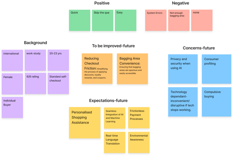
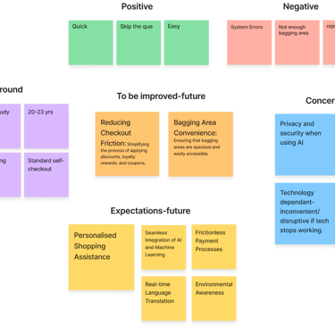
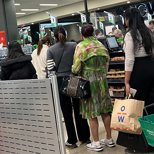
The core problem
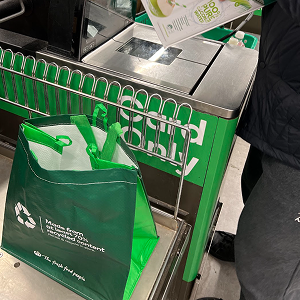
Traditional self-checkout creates friction in three fundamental ways. First, it forces double handling of items, shoppers scan products and then re-bag them, repeating the same action with no added value. Second, it introduces constant system doubt. Users are never fully sure whether an item has been scanned correctly, which leads to hesitation, rescanning, and stress. Finally, the experience ignores physical ergonomics. Counters rarely accommodate bags, personal belongings, or drinks, resulting in clutter and discomfort during checkout.
Self-checkout wasn’t failing because of a lack of technology.
It was failing because it didn’t respect how people actually shop.
My role
I contributed as a designer across research, concept development, and interaction design.
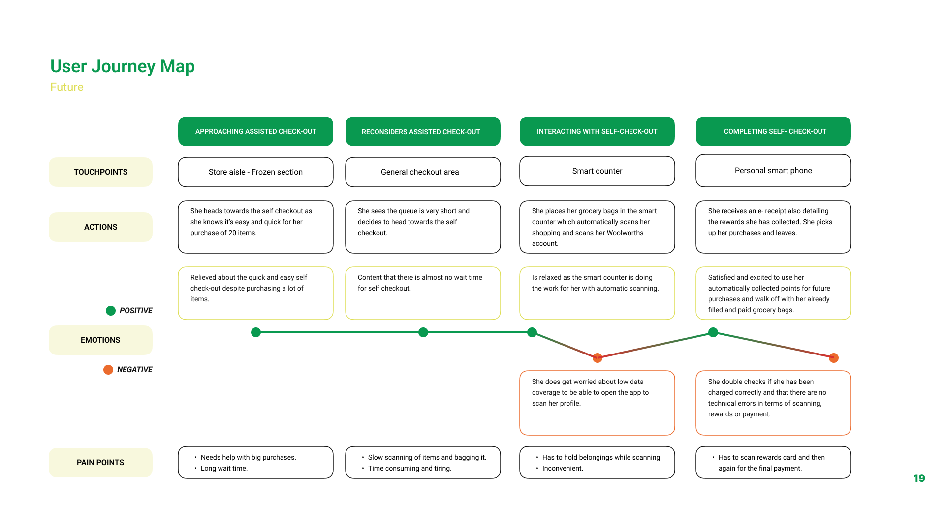
I supported user research through surveys, interviews, and in-store observations, and helped analyse findings to identify key friction points in existing self-checkout experiences. These insights informed user scenarios and current and future state journey maps.
On the design side, I contributed to ideation and interaction flows for the Scan & Go system, worked on interface design and system feedback, and supported the physical counter concept to improve comfort and reduce cognitive load. I also contributed to prototyping, user testing, and final presentation.
Key design decisions
1. AI-Assisted Bag Scanning (Removing Double Work)
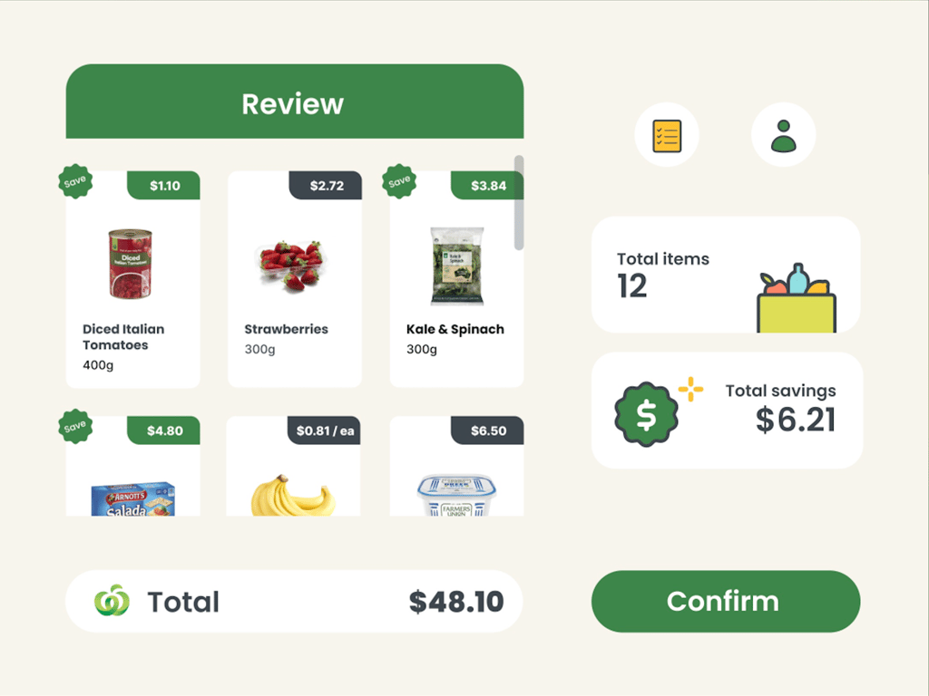
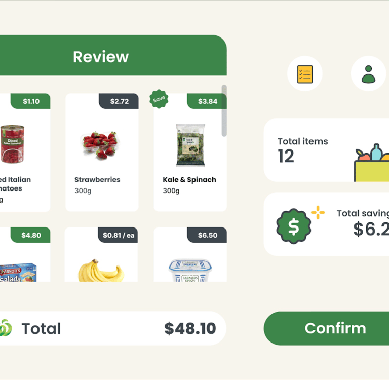
Instead of requiring users to manually scan each item, products are automatically detected when placed into the bag using AI vision built into the counter. This removes the need to scan and then re-bag items, aligning the checkout flow with natural shopping behaviour.
Each detected item appears instantly on the screen, allowing users to review and confirm their items before proceeding. This preserves trust and control while eliminating unnecessary effort.
Why this mattered:
It reduced repetitive actions, shortened queues, and made the experience feel intuitive rather than transactional.
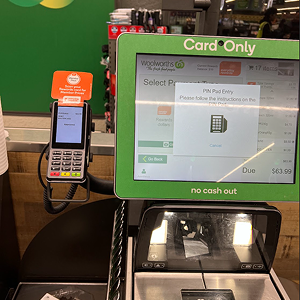
2. Real-Time Confirmation & User Control
Automation was paired with clear, real-time feedback. Every scanned item appears immediately on the screen with its name, price, and confirmation state. Before payment, users can review the full list and make adjustments if needed.
This design balances automation with transparency, ensuring users never feel unsure or disconnected from the system’s actions.
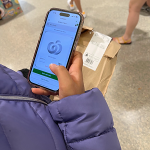
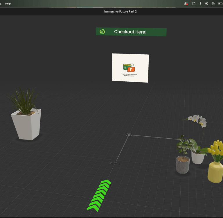
3. Automatic Everyday Rewards Integration
The system automatically recognises the user’s Woolworths account and applies their Everyday Rewards card without requiring a separate scan or action.
Why this mattered:
It removed a commonly forgotten step, reinforced value for loyal customers, and kept the checkout flow uninterrupted.
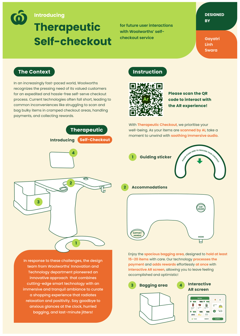
4. Rethinking the Physical Counter
The physical checkout counter was redesigned to support real, everyday needs. Its shape allows space for handbags, backpacks, and shopping bags, reducing clutter during checkout. Integrated hooks provide a place to hang personal belongings, while a cup holder and key tray address small but frequent user frustrations.
These details reduce physical and mental load, especially during busy shopping trips.
5. Designing for Flow, Not Speed Alone
The goal wasn’t simply faster checkout, it was smoother checkout. Each interaction answers a clear user question: Has this item been scanned? Can I trust the system? Am I ready to pay? Clarity was prioritised over raw speed to reduce anxiety and hesitation.
Outcomes
As a concept, Scan & Go demonstrates a therapeutic self-checkout experience with no duplicate actions, reduced cognitive and physical load, and higher user confidence through visible system feedback. The design shows how small, system-level changes across AI, interface, and physical space can significantly improve everyday interactions.
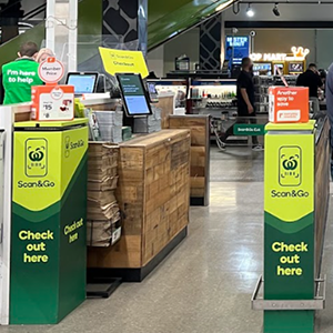
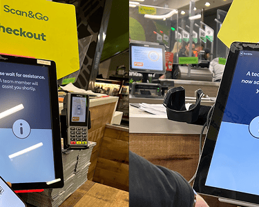
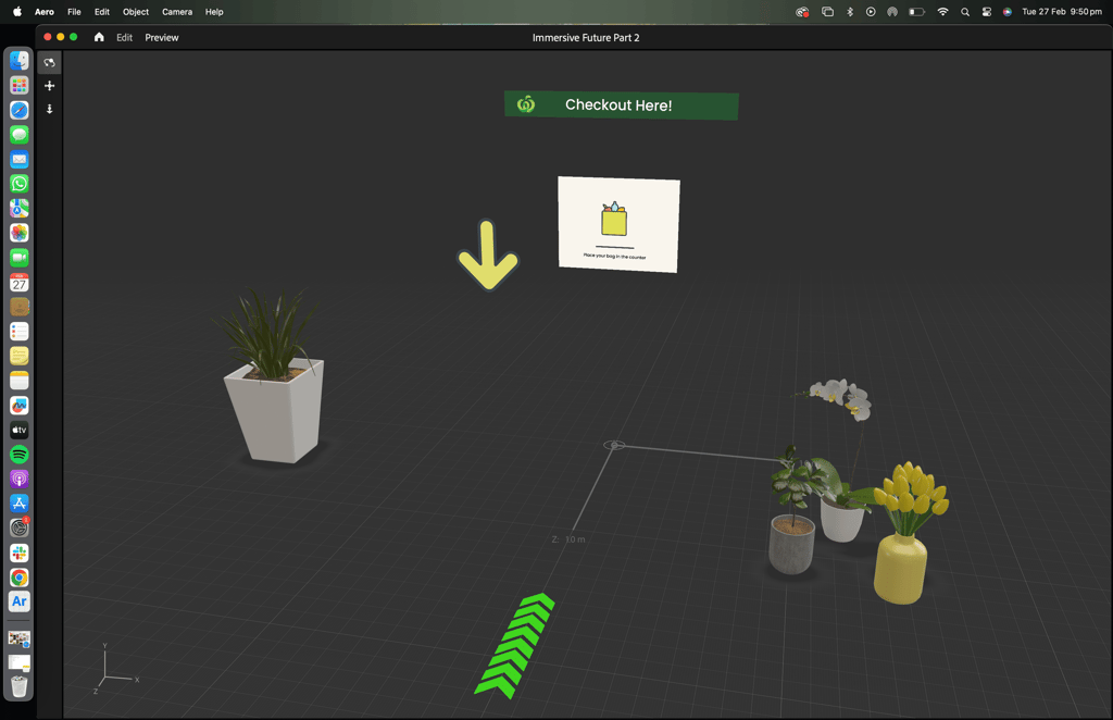
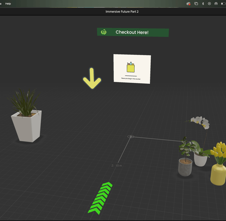
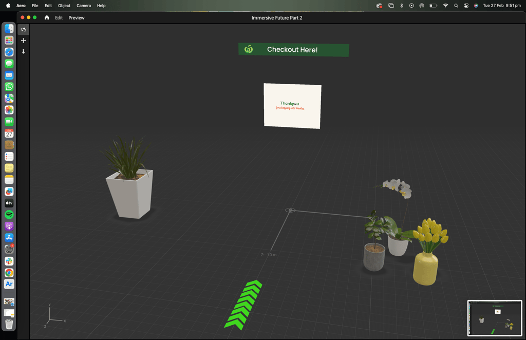
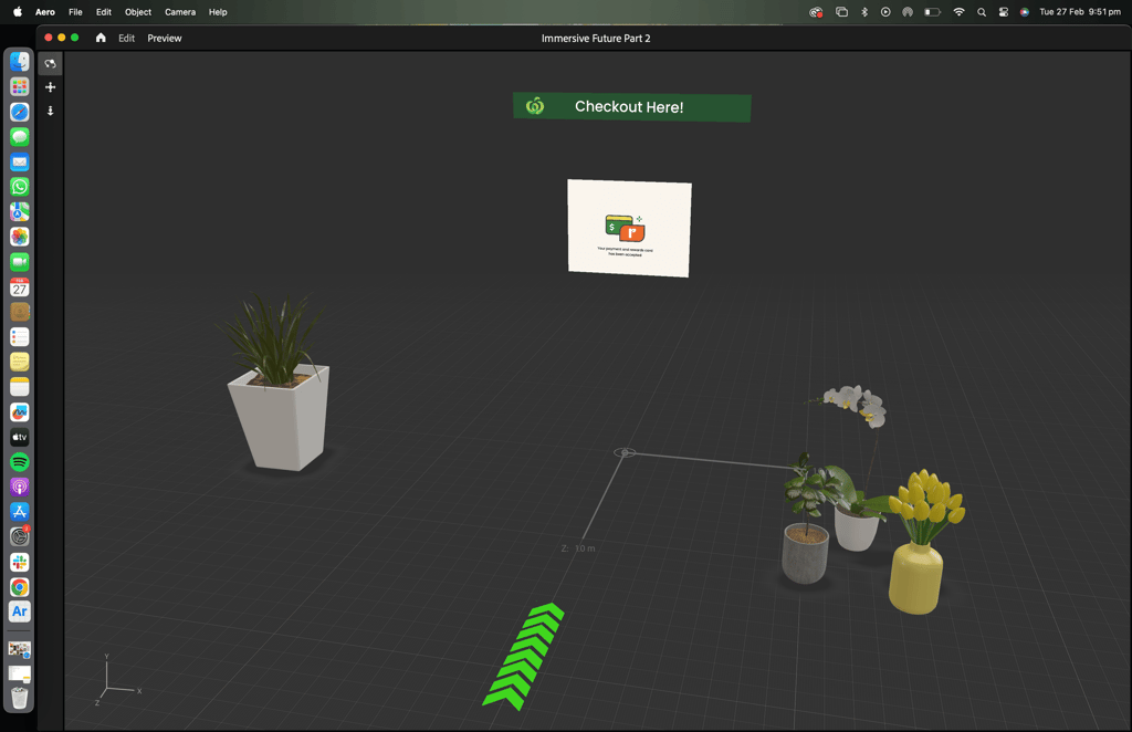
Self checkout screen design
Combining the aspects of assisted checkout, scan & go check-out technology and smart ai-powered counters we present the following design solution for the problems discovered through this research.
Imagine a self-serving smart checkout counter with ample of space, deep enough to hold at least 15 - 20 items. It operates autonomously and effortlessly scanning the items and handling the entire process simultaneously such as: Profile --> Payment --> Rewards --> Exit.
Presentation poster design
Aero screens
The final concept is presented through the documented interaction flows, AR prototype screens, and design artefacts shown above. The experience was originally demonstrated using a physical checkout counter cutout paired with an Adobe Aero, based AR prototype. As the platform has since been discontinued, the work is represented here through process documentation and captured prototype states.

The hardest part
The hardest challenge was balancing automation with trust.
Too much automation feels opaque, while too much confirmation slows users down. Designing a system that acts on the user’s behalf while keeping them informed required careful restraint and deliberate feedback design.
What I'd do differently
With more time and scope, I would test the physical counter layout with real users in-store, explore edge cases such as misreads and bulk items, and validate accessibility considerations for users with mobility restrictions. This would help refine both the digital and physical components of the system.
Key takeaways
I design systems, not just screens.
This project required thinking across AI, physical space, and digital interfaces.
I focus on eliminating unnecessary work.
Removing double scanning and re-bagging was a core product decision.
I design automation with transparency.
Users stay informed and in control, even as the system does more for them.
I care about physical and emotional comfort.
Counter design, hooks, and holders reduce stress in subtle but meaningful ways.